Mario, Mario
 Words: Luke Lucas Images: Mario Hugo
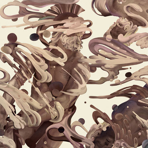
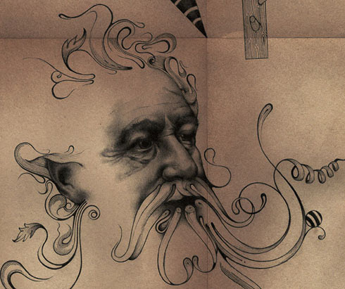
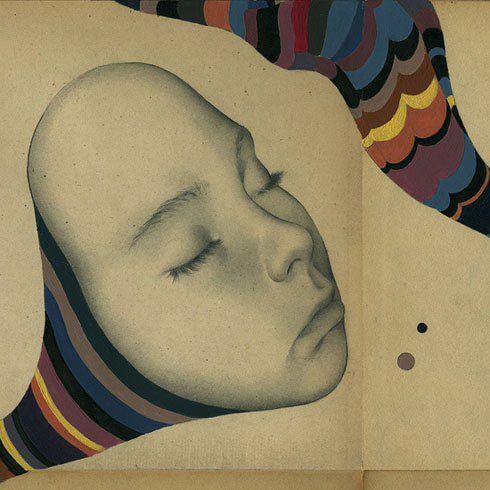
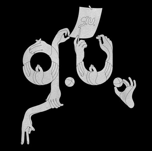
Mario Hugo’s illustration, typography, design and art direction is of such a standard that it sets the minds of even the most left-brained amongst us alight. He’s as much a darling of the bloggers as he is of the world’s biggest magazines, proving that the best visual communication really does speak to everyone. Luke Lucas caught up with New York based illustrator, designer and business man to talk antique shops, drawing and the fate of print design….
Luke Lucas: Can you tell us a little bit about yourself and your background. Were you born and bred in NY?
Mario Hugo: Sure – I’m a first generation American in an otherwise Argentine family. I was born in the suburbs of New Jersey, spent some time in Boston, and I’m currently living and working in New York City.
LL: When did you first decide you were going to be a designer?
MH: I’m not certain if there was a specific time. I thought there must be some more practical profession, but I’ve been drawing since I was a kid and I just kind of fell into the design stuff, with a couple of major catalysts along the way.
LL: A good portion of your work is editorial work and the printed medium really suits that level of detail you put into your illustrations. Do you ever worry that with the push for a greener world print as we know it will become an endangered species?
MH: I frequent antique shops, I love used book leafs, and I really like the idea of relics and ritual. I know where we’re headed, and I work digitally and in web all the time, but I think there is still a significant counter-current to the web, and that counter-current is where work feels most honest to me. I’m not too concerned with the death of print just yet, because I really believe in the beauty of tactile, tangible things.
LL: You seem to be as comfortable with free flowing organic forms as you are with geometric, monochromatic palettes as kaleidoscopic, graphic as illustrative – the level of versatility in your approach, as a fellow designer, it’s something that’s hard not to admire. What’s your general process for responding to a brief?
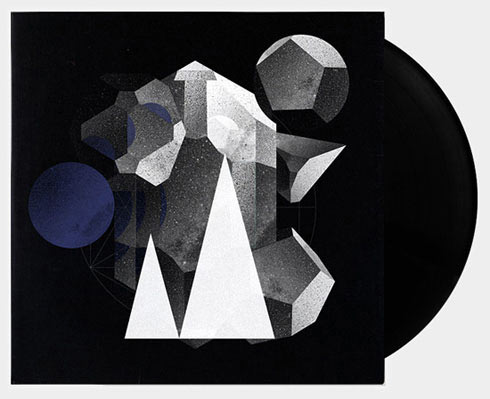
MH: Whether responding to a brief or not, I think every project is an opportunity to explore new avenues. I don’t like drawing distinctions between art, design, illustration, direction – I’d rather just make stuff. I like to treat my works as miniature experiments, where communication is the goal, and you can see the contexts build from piece to piece. I work in tangents a lot, so a small element in one piece may inspire entirely new projects. The aesthetic may change pretty dramatically, but we can’t really escape our personalities, or a tonality to the things we make, and I think tonality is more important than any style.
LL: Are there any modern day designers or past masters whose work inspires you? Where do you find your inspiration?
MH: I’m really inspired by so many things that I almost feel naming any author, artist, or designer can be a discredit to all the people who don’t get mentioned – but, I love old stuff, again, so the first three off the top of my head are maybe Bruno Munari, Paul Klee, and Ferdinand Hodler. I find inspiration everywhere really – books, movies, radio, music – and the list is forever growing.
LL: How long on average do you spend on an illustration?
MH: Too long. I’m trying to loosen up a bit now, but it’s not going too well!
LL: It’s great to see a modern designer still using as much pain, pen and ink as you do. How important are computers for what you do?
MH: I work a lot on computers for commercial projects (deadlines!), and rarely physically combine the computer and a hand drawing. It’s an either-or thing for me, really. I may spend time figuring out a composition in photoshop, and then commit that composition entirely to paper. Everything informs everything for me, and I might not stumble on techniques in my drawings if I hadn’t discovered something toying on a digital project for a client. I’d be lying if I said I didn’t wish I had more time for proper drawings though.
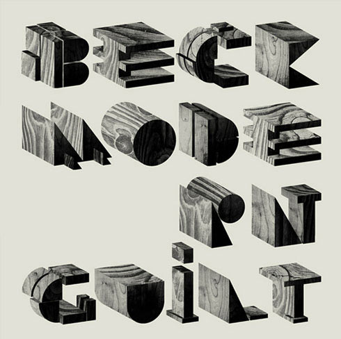
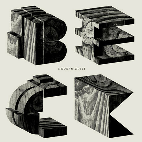
LL: Those album cover concepts that you did for Modern Guilt were amazing. I don’t understand how they could see such interesting work and then go “no actually let’s run with the boring cover with the helvetica type and photo that looks like a million other images”. It must have been disappointing. What’s up with Beck?
MH: Definitely an interesting project! I tend to enjoy working from context – I like making a sleeve look like the music sounds – but this project took place in a bit of a vacuum, so there was no music, a placeholder title (that eventually stuck), and I was basically asked to make whatever felt interesting to me personally. So I ran with it… for like thirty comps over the course of two months. Honestly, the process went really well, the label was very happy with the designs, but it wasn’t right for jacket I guess. Anyway, Beck’s rejection had its perks and I work almost exclusively in music at the moment. I should note, though unused as a sleeve, the graphics were later re-appropriated to support the Modern Guilt tour – no harm, no foul!
LL: Can you tell us a little bit about Hugo & Marie and how that came about? Do you find it hard to chop and change between designer-Mario and businessman-Mario?
MH: I have always been a bit ambivalent about representation, and I am very invested both in my personal work and the work of people I admire – I think it’s a sentiment a lot of artists share. Jennifer [Marie] Sims and I found Hugo & Marie was a way of expressing a love of art, design, and culture by sharing and promoting the work of talented friends whose work we really respect, and doing it all in an environment that was really open and comfortable for the artist. It can be challenging jumping from role to role, and it’s a weekend killer, but it can be fun too. Way more challenging than I’d ever imagined though!
LL: What do you look for in the artists you represent?
MH: We just want to really believe in someone’s work – there aren’t any other guidelines. I think we tend to lean towards craft and the kind of designer who lives/breathes/eats what they do.
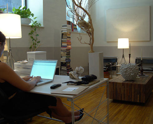
LL: What’s your studio set up like? Do you share your space with others?
MH: We currently work from the apartment – it’s been a bit overrun by the creeping office/studio lately, so we’d like to move into a proper office sometime soon[ish]. And hopefully I’ll end up with a gigantic bar and a nice old turntable in place of the desks that take up half the apartment.
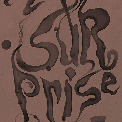
LL: You’ve recently contributed to the Some Type Of Wonderful project with shows coming up in Melbourne and Sydney early this month. What do you think of the project and how did you come up with the idea for your response?
MH: It’s a great project, and an awesome outlet. When I’m asked to participate in exhibitions with open briefs, I typically take the opportunity to play with new ideas – milky, icy typography felt on the money for February and the technique has inspired some other recent type treatments I’m happy with – everything informs everything.
LL: Any plans to come to Australia? Do you know much of the Australian design community?
MH: No travel plans at the moment, but I ought to mention one of those catalysts up in the “When Did You Know?” question was at the Semi-Permanent conference back in 2002 or 2003, so I’m well aware of Australia’s rather awesome design scene!
LL: What next for Mario Hugo? Any interesting projects on the horizon?
MH: We have a big new Hugo & Marie project launching in the next couple months which I’m super excited about, I’ll have a bunch more music packaging to share soon, and I’ve been delinquent about a collaborative piece I’m working on with Micah Lidberg, which reminds me…
Mario Hugo’s work appears in Lifelounge’s Some Type Of Wonderful this month in Melbourne and Sydney
For your chance to win a Some Type Of Wonderful calendar just email [email protected] and tell us why you should win.
Melbourne – October 1-16
Opens Friday Octopber 2 at No Vacancy, 191 Little Lonsdale St, City
Sydney – October 23-28
Opens Friday October 23 at China Heights, 257 Crown St, Darlinghurst
Luke Lucas speaks at Semi Permanent on October 9 & 10 at the Melbourne Convention & Exhibition Centre. Book tickets.
Next Article: Asuza – Your Own Life


