Hot Graphics
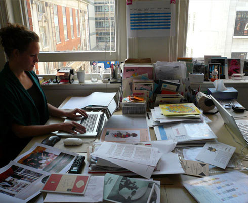 Words: Tristan Ceddia Images: Grafik
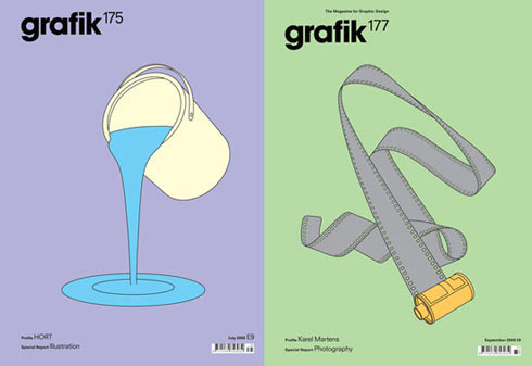
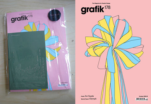
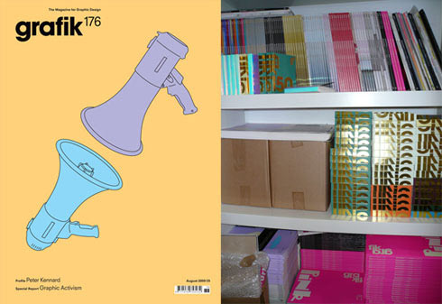
Circulating in one way or another since the mid-80s, London’s Grafik magazine showcases multidisciplinary design work from the worlds most influential known and unknown creatives. Building a cult following from discerning designers and students a like, the magazine supplies a fresh look at the current state of the world in design. On the eve of Grafik’s trip down under for Semi Permanent, Tristan Ceddia asks editor-in-chief Caroline Roberts to shed some more light on this influential publication…
Tristan Ceddia: Grafik is in its twenty third year as an independently published magazine. What’s the history behind Grafik?
Caroline Roberts: Grafik started life as Hot Graphics International, a rather dull large-format magazine that was invented solely to capitalise on the new advertisers that were emerging during the ‘digital revolution’ in the mid 1980s. It then became a monthly magazine and turned into Graphics International, with a redesign by Meta and a new editor – Tim Rich.
I took over as editor in 2001. By then Grafik had been purchased by a large publishing house based outside of London, but the editorial team (of myself and then Angharad Lewis) were in an office in the East End near Brick Lane. We were pretty much left to our own devices, which is how we liked it. In 2003 I persuaded our publisher at the time that we needed a redesign, and in July of that year the magazine turned into Grafik, with a radical redesign courtesy of MadeThought.
In 2005 Angharad and I (and another business partner) did a management buy out, we moved to our current office in Fitzrovia and the magazine became independently published. Earlier this year we sold the magazine, and Grafik is now published by Adventures in Publishing Ltd but remains independently published. Nothing has really changed in the day to day running of the magazine (apart from expanding the team), but we now have some much needed investment which will enable us to put some longstanding plans in place.
TC: Each issue of the magazine holds a specific theme with its content. Has this always been the way things have been run? How have things changed over the years?
CR: We’ve always had a Special Report – it’s the part of the magazine that covers a subject in more depth and looks outside the immediate area of graphic design. Over the years we have expanded this section—and as well as the regular Special Reports into topics such as music, fashion and photography. We have added Graphic Design Heroines, the Illustration A-Z, Defining Moments in Type.
TC: Who was responsible for the initial conception of the magazine and who is involved now? Has anyone been working on Grafik since the beginning?
CR: I was editor from 2001-2009 and am now publisher and editor-in-chief. Angharad Lewis joined in 2003 and is now the editor. We also have an in-house designer and part-time design assistant, a sales manager, a marketing manager, a part-time senior reporter, a web and production editor and a studio assistant.
TC: Grafik’s recent redesign includes a new variation of your masthead. What is the idea behind each redesign? Does the content of the magazine vary as well as the design?
CR: We keep the basic editorial structure, but take the opportunity to reorganise it and introduce new features, such as How to be Green, and Michael Bojkowski’s magazine column. We’ve always said that you need to redesign the magazine before the readers think you need to do it – by then it’s too late. It’s all about keeping things fresh and exciting – and if we’re feeling bored then we know it’s only a matter of time until are readers are too. The main impetus for the latest redesign was to introduce a typeface that would be more readable, and to reorganise the back section of the magazine. We’ve had fairly radical redesigns in the past, but our readers are generally happy to embrace the change.
TC: You publish content varying from commercial graphic design to photography, illustration and everywhere in between. This seems to break away other more traditional graphic design magazines? Has this always been Grafik’s prerogative?
CR: The best graphic designers look outside of graphic design for inspiration, and we try to reflect that in the magazine. We just fill it with stuff that we like, and hope our readers will too.
TC: Speaking personally, I find most graphic design magazines to be rather uninspiring. Grafik seems to appeal to a niche set of creatives, professional and non-professional, who would not traditionally read graphic design magazines. How do you maintain fresh inspiring content month after month?
CR: Blood sweat and tears! It’s basically by assembling a passionate and committed team, working with the best people we can (within the obvious budgetary restraints), and by sourcing as much original content as possible.
TC: Your magazine publishes world wide content from hard-hitting designers through to students. How do you source material for each issue? Do you trawl the internet or is content discovered through other sources? What excites the people at Grafik?
CR: Ideas come form many sources, but over the years we have put a huge amount of effort into developing contacts, treating the work shown with sensitivity and presenting it in the best possible way. That way we can ask for exclusivity and produce exciting and original content.
TC: Grafik presents its content in a way that is in some ways often as interesting as the content itself. Strong art direction is clearly responsible for this. How important is this?
CR: Very important, given our very discerning readership. Our magazine showcases the best in graphic design – if the magazine itself isn’t designed well, we lose credibility with our readers. Obviously you can’t please everyone all of the time, and our redesigns often provoke strong reactions initially.
TC: Can you tell us a bit about the process of putting an issue together?
CR: We work on a four week turn around, two weeks of those four are design time – as we commission writers we have to start on the next issue before the one that we’re working on is finished. As well as the writing that we do personally, we have to gather content from lots of different sources, which involves being very organised and doing lots of nagging. Having our designer Matilda Saxow inhouse has made a very positive difference to the process, as there is a constant dialogue between the design and editorial teams.
TC: Joseph Allen Shea spoke to Australia’s Doing Bird magazine in Issue Two about the importance of creating a magazine in a world fixed on the internet. What do you feel the importance is of the magazine in this day and age?
CR: There are many different ways to access content now, but there will always be a place for printed magazines. Our magazine is full of beautiful pieces of print, so it makes sense that it should also attempt to be one.
TC: What exciting moves has Grafik got instore for the future?
CR: Our website is finally being launched this Autumn. Honest.
Grafik magazine speak at Semi Permanent on October 9 & 10 at the Melbourne Convention & Exhibition Centre. Book tickets.
Click here to view Grafik’s poster exhibition at the recent London Design Festival.
Next Article: Krozm – Smoke, Screens & Mirrors


